

The Mariposa Folk Festival logo is one that has gained recognition both nationally and internationally as the popularity of the festival has grown.
The name “Mariposa” was chosen in honor of the town featured in the novel “Sunshine Sketches of a Little Town” by Stephen Leacock, which was loosely based on Leacock’s hometown of Orillia, Ontario. It only makes sense that the logo is a smiling sun with red and yellow beams of light. The logo represents the festival’s mission to create a fun, inclusive, and loving event.
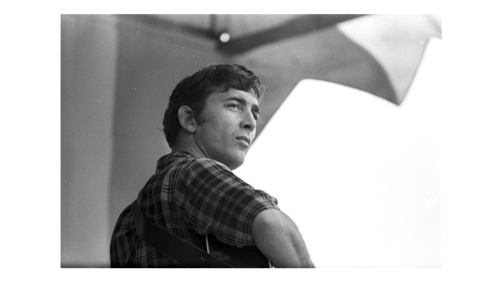
When the festival began in 1961 a graphic artist by the name of Ian Tyson was hired to design both the festival’s first poster and first logo. Festival founder, Ruth Jones McVeigh, had close ties to Ian and knew he would be a great fit for the job. Tyson was working part time at a graphic design agency in Toronto, while also working on becoming a professional musician. His logo resembled more of a flower than the sun you would see today. Tyson went on to become a Canadian folk star and release hit songs like “Four Strong Winds” and “Someday Soon.” With his strong Mariposa roots, Tyson holds the original logo close to his heart and has a copy of it hanging in his Alberta home today.
After the festival moved from Innis Lake to the Toronto Islands in 1968, the festival decided it was time for the logo to be updated. The change of festival locations also noted a time when Mariposa found itself transitioning into a new era of folk music. Tom Bishop, President of the festival at the time, wanted to inject a sense of youthful vibrancy into Mariposa. Years earlier the festival had received criticism from the American songwriter Tom Rush, who remarked that Mariposa was “too academic.” A brand refresh would note that Mariposa was far more than just a weekend of folk music, but rather an escape from the stresses of life to a community with open arms.
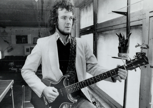
Murray McLauchlan, a Canadian singer-songwriter legend with close connections to the festival, was asked to refresh the logo. This redesign gave Mariposa the iconic smiling sun logo that you see today. The new logo and festival location marked an era of redefining the folk genre by introducing world music, a Native People’s area, and musicians from diverse cultural backgrounds to the festival.
In the late 1980s and early 1990s there was yet another shift in the Mariposa brand. The festival removed the word “folk” from much of the advertising, including posters and merchandise, and added electric guitars instead of the original 6 string acoustic. However, when the festival returned to Orillia in 2000 the festival returned to its roots and added the work “folk” back into their program as well as began to highlight the acoustic guitar over the previously popular electric. As Mariposa returned to its roots in Orillia it’s easy to see how their branding fell right back into the place they call home.
During the early 2000s a graphic designer was hired to help create t shirts, posters, and other merchandise for the festival. While a few other logos were created and considered there was no changing that iconic sun. Mike Hill, former Artistic Director and Vice-President of the festival commented, “You don’t mess with the Coca Cola logo or the Nike Swoosh, let’s do the right thing.”
To festival-goers the smiling sun is a recognizable trademark. Unique amongst Canadian music festivals, Mariposa has distinct recognition from coast to coast. Ted Markle, Mariposa Board Member, mentioned, “Our iconic logo and its unique creation story is part of the magic. The image conveys Mariposa’s warmth, joy, and sense of community.” The logo is displayed all over the festival, you can find a 20 by 30 foot version hanging at the mainstage, plastered on CD’s, t-shirts, blankets, and adorned by festival volunteers. If you’ve been to the Mariposa festival, you’ll definitely know what the logo is!

As the festival entered its seventh decade the Mariposa Folk Foundation created a re-branding initiative and emphasis on improving their online presence that retained the iconic smiling sun. Beehive, a Toronto-based design agency, was brought in to refresh Mariposa’s website and branding. Mariposa and Beehive decided to keep the Mariposa logo as a celebration of its extensive history and its digital ability to emphasize their past even more. As a way to integrate more modern typography the smiling sun replaced the “o” in Mariposa so the iconic logo would always be married to the event’s name.
The smiling sun represents the happiness and smiles that fill the festival each year on the same weekend. For the people who attend the festival year after year the logo represents a highlight and an escape to a serene community of folk music, acceptance, and fun. Current Mariposa Folk Festival President, Pam Carter remarked, “the logo has been around for so long and represents so much history for Mariposa, there’s some genius in it.”